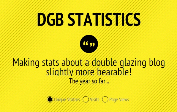
I have often displayed this site’s stats on a page right at the very top, in very boring boxes on a very boring background. As functional as that is, it’s not very nice to look at. So, I have been looking at the rise of the infographic (funky image displaying stats and facts) and thought I ought to have a go at that. So I did. I found some free software at http://infogr.am/beta/ and had a dabble this afternoon while I had a spare hour. This is my first attempt at something like this so I thought I’d better keep it basic and easy to understand. Future ones that I decide to do will be a bit more in-depth.
What do you think? It’s been great to see more and more people coming to read DGB, and for that I am very grateful to each and every one of you! Thanks for your support and continued readership. One thing that I would point out which the text at the bottom of the infographic hinted at, is the projections.
Those projections are based on the averages of the year so far. However, what it doesn’t take into account is that at the end of every year there seems to be a surge in page views, visitors and unique visitors. Whether this is because there seems to be more time on people’s hands as the industry winds down or not I don’t know. But what I do know is that as we approach the end of the year, those projections are likely to change and the end results will probably be higher by December 31st.
The main stat that this will impact on is Page Views. I have set my goal in increasing my stats year on year. In terms of Visits and Unique Visitors I look set to do that with some time to spare. However with Page Views it looks like it could be a close call by the year end. All being well there will be that bounce in traffic that has happened the last four years and the Page Views for 2013 will end up being slightly higher than 2012. But I need you guys to help me out with that ;-)
I’ll be doing another infographic at the start of 2014 to show you all how DGB fared throughout the whole of 2013.
You can get a more detailed breakdown of the site’s stats here: https://www.doubleglazingblogger.com/dgb-stats/
Next time: my thoughts on Ed Miliband’s proposed energy policies if Labour win the next General Election.


Nice looking graph DGB – but shouldn’t unique visitors per month be averaged out (eg around 5,000 a month at current rates) rather than added up over the year?
Hi Anon
This was just a first attempt at an infographic, just to try and get my head around the software I was working with. You are absolutely right though that I should do a monthly averages one. This is next on my list to do and shall probably create that one over the next few days!
Thanks for your comment
DGB
A nice way of displaying the stats, however a bright yellow background with black text is not very easy on the eyes to look at. Use more neutral colours and i think you will be on to a winner! ;)